
Dashboard
When you first log into ALO you will see the Dashboard. You can always return to the Dashboard by clicking on the “a”logo in the upper left corner of the screen.
The Dashboard provides a quick overview of the assessment data stored in your account. The dashboard has various tools and features that allow you to customize the viewable data.
Data Views on the Dashboard
Benchmark Overview
The Benchmark Overview shows a summary of beginning-, middle-, and end-of-year benchmark data that is customized to each user’s level of access. The half-donut icons are interactive, and will display more information when you hover over each of the subsections.
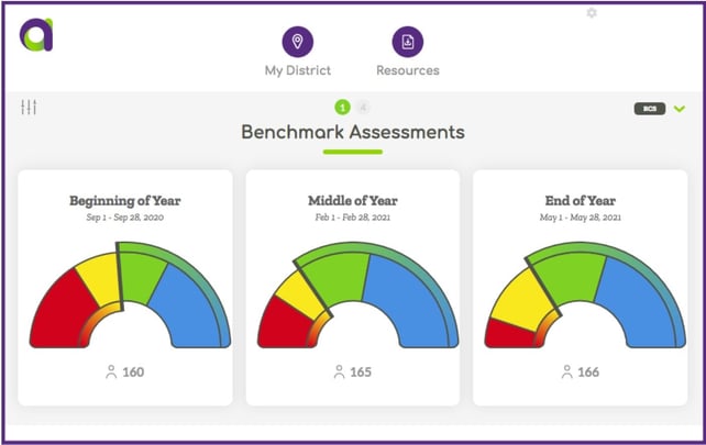
The Benchmark Overview display can be further customized using the following options (located along the top of the page).
| Icon | Name | Function |
 |
Filter Icon | The Filter Icon allows a School- or District-User to filter their Dashboard view to a specific School or Class. |
| Measure Menu | The Measure Menu can be used to change the display from the Reading Composite Score (RCS) to a specific measure or score type. | |
| Grade Level | The Grade Level buttons can be used to change the grade level that is displayed. |
Progress Monitoring Status
The Progress Monitoring Status section displays a summary of the status of students enrolled in progress monitoring testing.

The color indicators reflect the status of a student's last three data points in relationship to their aimline and goal with consideration for the frequency of scheduled monitoring. The data display is interactive and will display more information when users hover over each subsection.
The table below provides details about each Progress Monitoring Status category.
| PM Status | Description | Recommendations |
| Green | Students in the green category are being monitored on the set frequency and their last 3 data points are above the aimline. | Students in the green category are predicted to meet their later goal. Continue providing effective instruction. |
| Yellow | Students in the yellow category are being monitored on the set frequency and their last 3 data points are varied - some above and some below the aimline - and a prediction about progress towards their goal cannot yet be made. | A prediction cannot yet be made for students in this category. Continue to provide effective instruction and consider modification to instruction and/or intervention support. |
| Red | Students in the red category are being monitored on the set frequency and their last 3 data points are below the aimline. | Students in the red category are not predicted to meet their later goal at this time. Consider immediate modification to instruction and/or intervention support. |
| Grey |
Students in the grey category either have too few data points (less than 3) or are not being monitored on the set frequency. |
A prediction cannot yet be made for students in the grey category. Consider modifying implementation to ensure that scheduled, ongoing monitoring occurs. |
Effectiveness of Instructional Support
The Effectiveness of Instructional Support section will appear on the Dashboard after middle-of-year scores are entered in ALO. It examines effectiveness of instructional support by grouping students by their benchmark status at one assessment period (displayed in the assessment bar icons) and then showing the benchmark status of students in each group at a later time point (displayed in the half-donut icons).
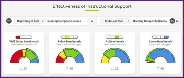
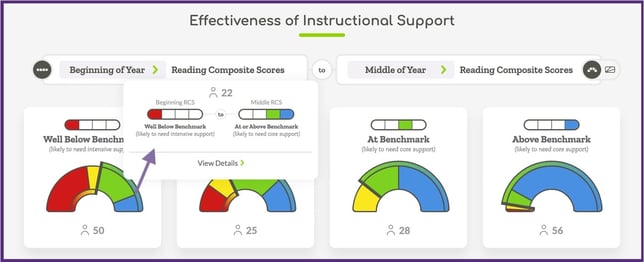
In the example below you can see that there were 50 students in the Well Below Benchmark category at the beginning-of-year. Of those 50 students, 22 reached a status of "At or Above Benchmark" by middle-of-year.
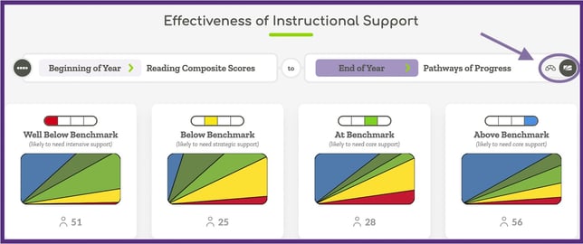
After end-of-year scores have been collected, users can switch the assessment periods they are comparing by clicking on either of the assessment period options.
This section can also be changed to show Pathways of Progress results by selecting the fan icon in the right corner of the display. In this view, the report still groups students by their benchmark status, and then shows the distribution of students in each Pathway for each group.
As with other ALO data views, users can hover over the data displays to see additional information or to open up a detailed student list view.